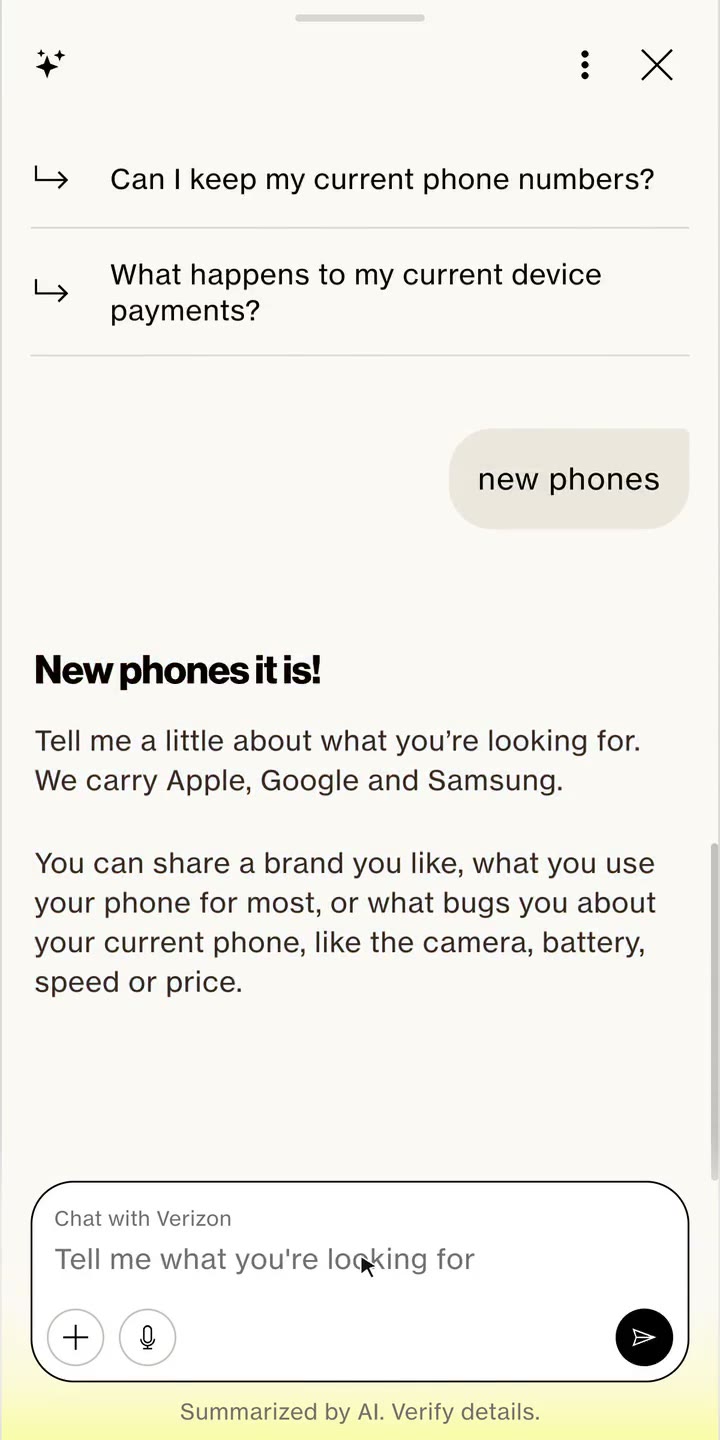
Verizon wanted more people to switch from other carriers in 2026. But switching took 14 to 16 steps, and people never saw if Verizon was better than what they had. The chatbot just copied the website, so it didn’t help.
The chatbot was scripted (deterministic): it replayed the website journey in chat. Research showed customers expected it to work like the AI tools they already use, so Verizon started experimenting with agentic AI that does the work for the customer.
Challenge
How might we use agentic AI to make switching faster and easier than ever, like a guided, consultative sale?
Solution
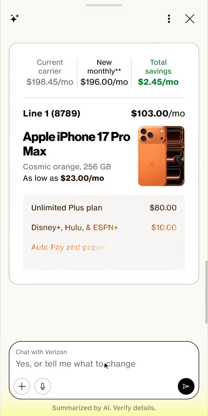
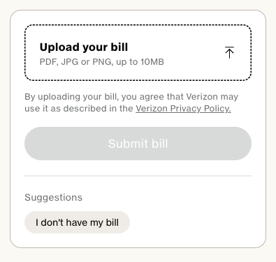
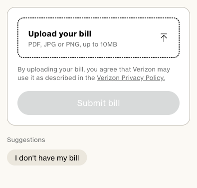
Bring your bill. The assistant reads it, matches it to a better Verizon bundle and takes the customer to a ready cart, with 60% fewer decisions.
My role
Senior Experience Designer, one of three, on the Verizon chatbot
I owned the overall journey structure and experience from upper to lower funnel, the new UX and UI patterns, and steering the generative UI. Timeline: 2 months for the switch journey, within a wider chatbot programme.
Leadership
Leading as a design and product leader
Set AI design best practices
Divided work across 3 designers
Led product vision workshops with PMs
Result
10 decisions to 4
per line, to build an order.
40% fewer drop offs
across the switch journey.
8 of 10 customers
found it easier to switch.
Research & Insights
Task analysis
I ran task analysis on UserTesting.com to understand how many steps a switcher goes through, and how they feel at each one. They felt overwhelmed by the choices and unsure whether switching would save them money.
Upper funnelLower funnel
Switchers only want to know if Verizon beats what they have. Instead they built an order from scratch, faced hundreds of options, and took too long to see if they would save.
The brief
For the PMs the ask was simple: take what is on the web, make it conversational and add widgets. I pushed back: the same steps and legal copy in chat would only make switching longer. I showed the team a journey with fewer choices and manual decisions instead, and asked a harder question.
Scrutinised design problem
If it is already on the web, why would someone use a bot for the same experience?
Faster and Easier
Faster
Start from what they already have
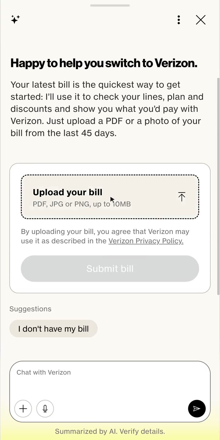
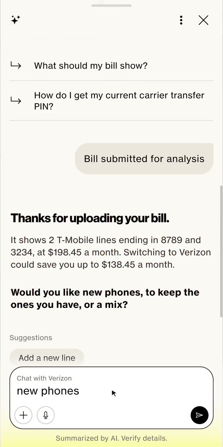
Customers should not be the ones working out the best plan, phone and offer. We looked at starting with questions, a plan comparison or the phone, but each still left the work to the customer. The bill already holds their lines, plan and spend. So the assistant takes their bill and matches it algorithmically to what Verizon offers. That answers the brief: a bot can start from what you have, the website can’t.
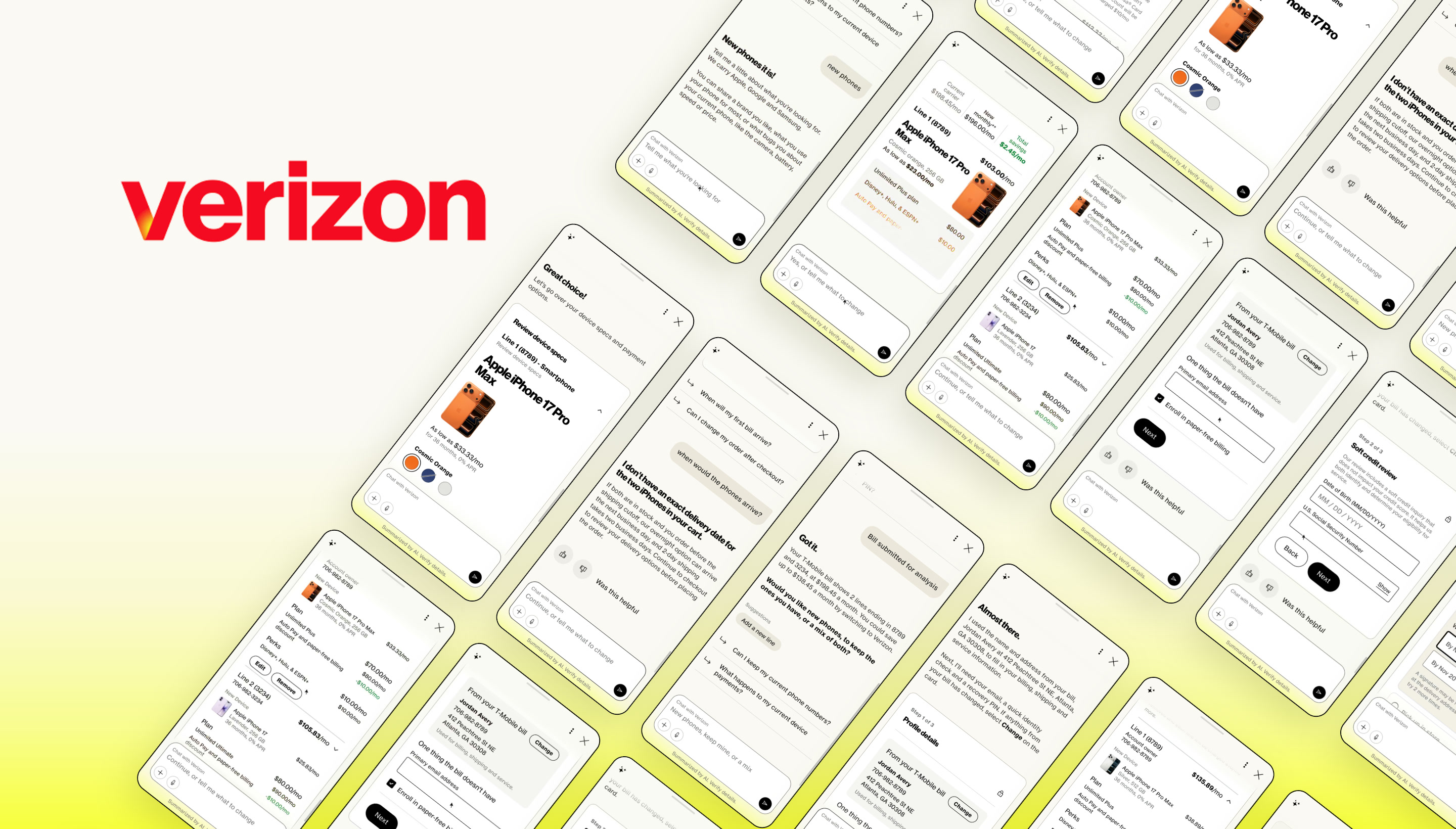
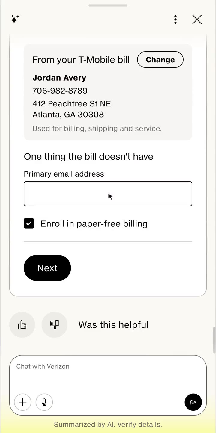
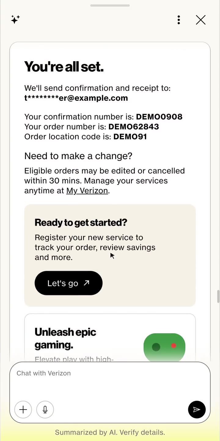
→Bring your bill: from the first message to a placed order, in one conversation.
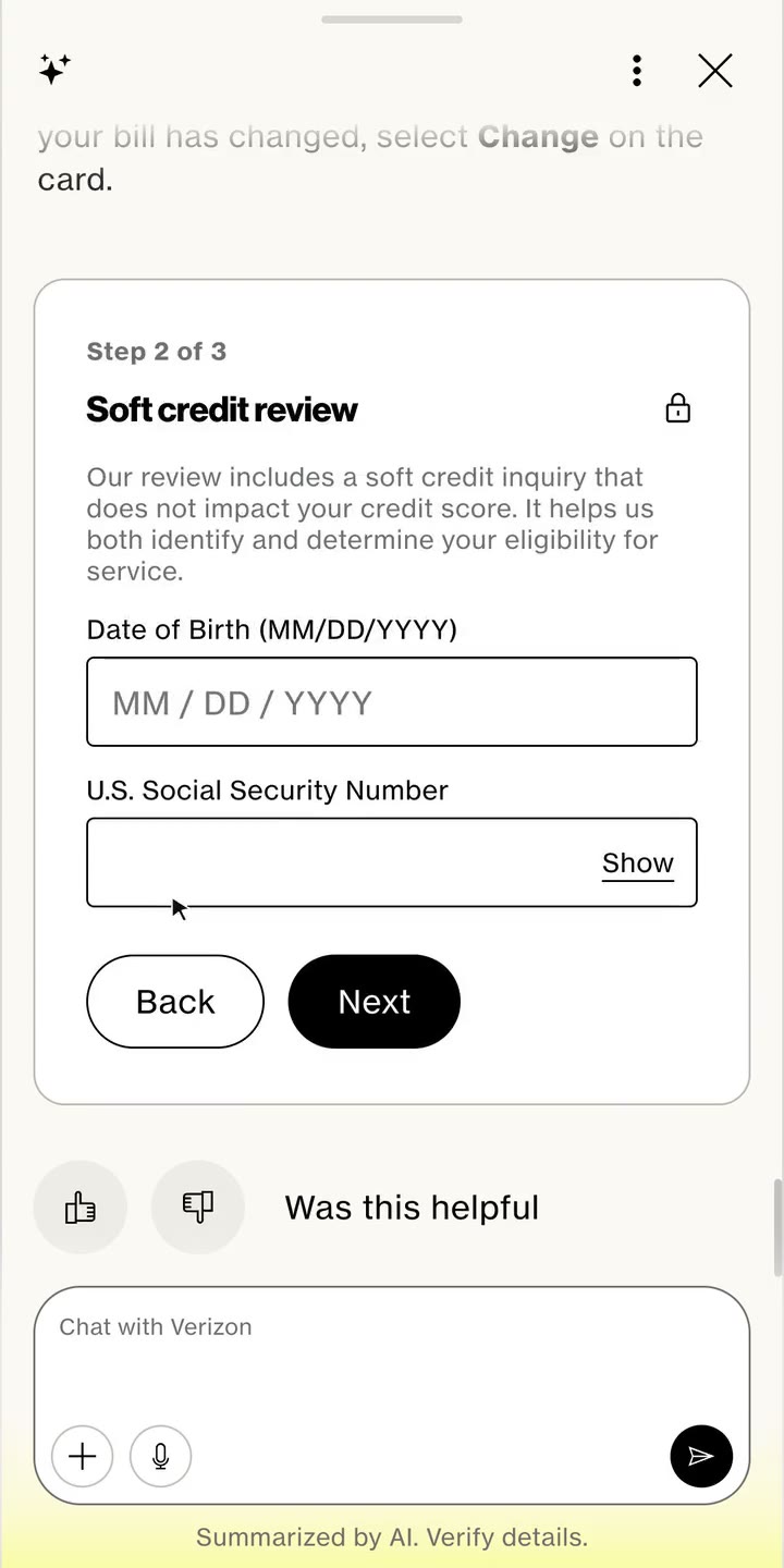
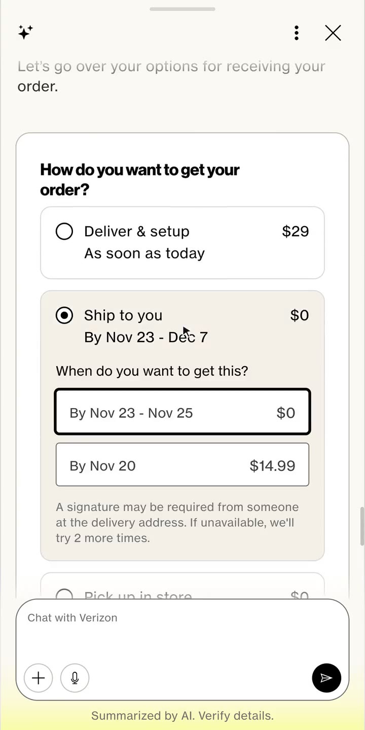
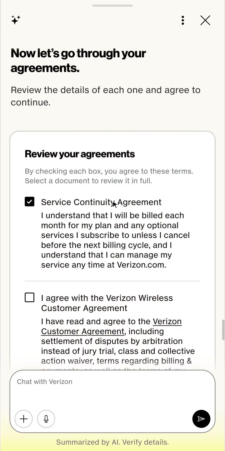
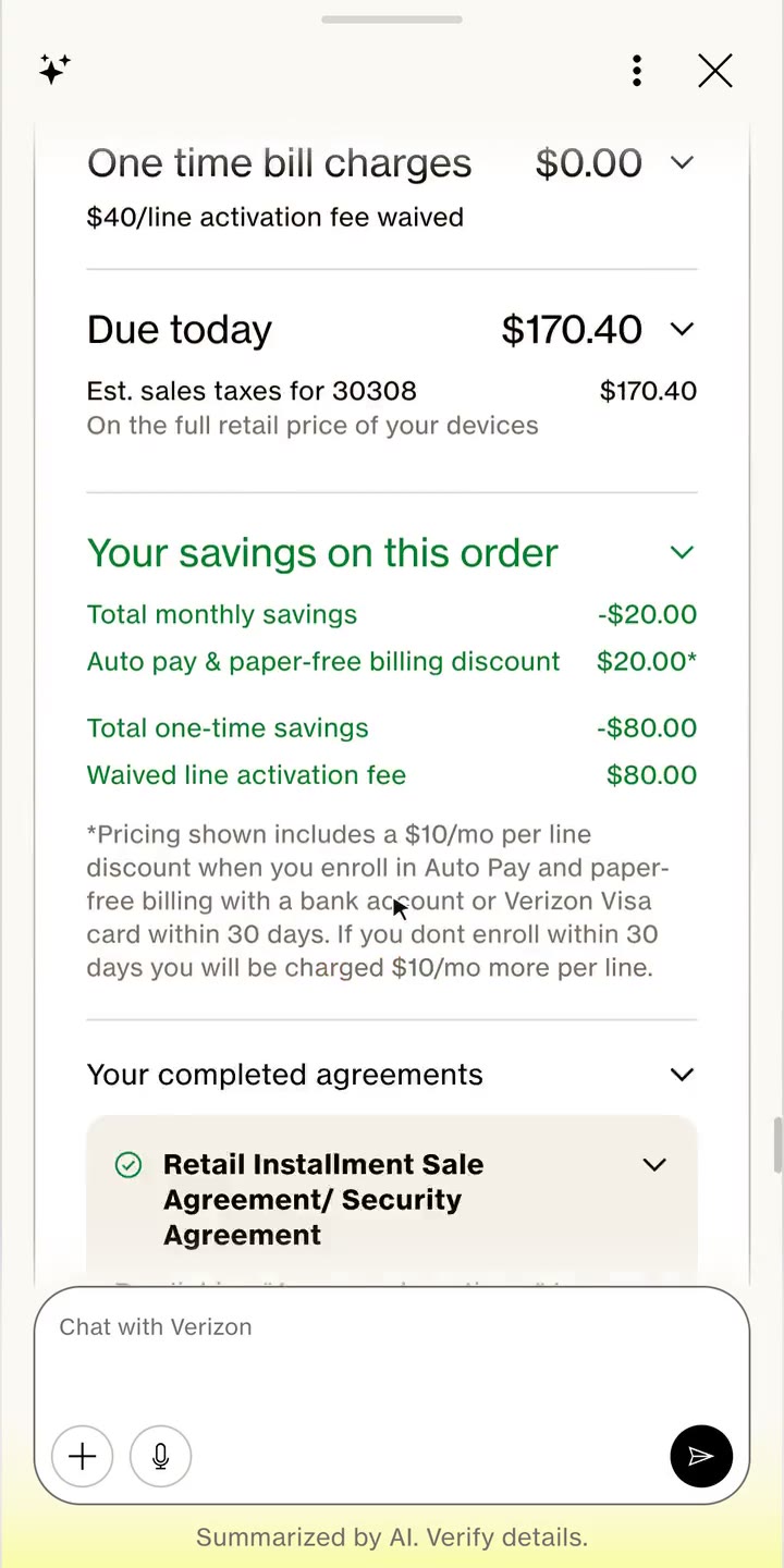
1. Upload the bill2. What the bill showed3. Tell us what you want4. The best recommended bundle5. Cart6. Profile, filled from the bill7. Soft credit check8. Delivery9. Agreements10. Order summary and payment11. Order placed
→Try it: I built this working prototype with AI, with real LLM replies and the bot and website in sync. Open the assistant and switch to Verizon.
Early versions saw huge deflection and less conversion as conversations drifted elsewhere. I set a rule: any side question gets a short answer that ends by pointing to the next step, so a detour never becomes an exit.
→Side question: answered, then straight back to checkout.
AI rules
How the assistant behaves
Answer side questions briefly, then point to the next step
Keep replies short, one idea per paragraph
Never ask for what the bill already shows
Recommend first, then let the customer change anything
02
What goes in chat, a widget, a suggestion or the FAQ
Every team asked where content belongs. I set a simple rule that the three designers and PMs used on every screen, backed by research showing content plus a widget beats either alone.
Conversation
Short answers and guidance
“When will my phones arrive?”
Widget
Choices with many options
Colour, storage and plan for each line.
Suggestion
The likely next step
“Continue to checkout”, one tap away.
FAQ
Fixed facts and policies
Trade in rules and broadband facts.
03
Suggestions inside the widget, or outside it
I wanted suggestions inside the widget, next to the choice. But each one needs a backend call, so the widget would load slower. After exploring the options below, we kept them outside.
What we wanted
Inside the widget
Closest to the choice, but the whole widget waits on the backend call.
Explored
Inside, behind a loader
The widget shows, with a skeleton where suggestions will arrive. Adds motion while the customer decides.
Explored
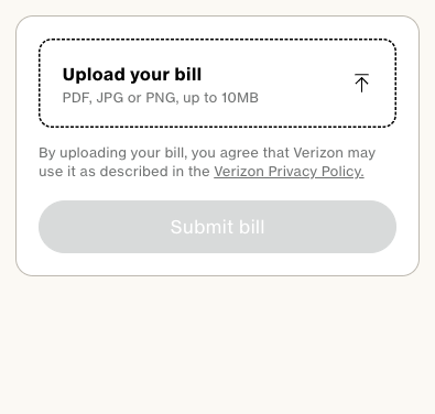
Inside, hidden until ready
Nothing shows until they load, so the widget shifts once they appear.
Shipped
Outside the widget
The widget loads at full speed, and suggestions follow below it on their own call.
04
Every line in one widget
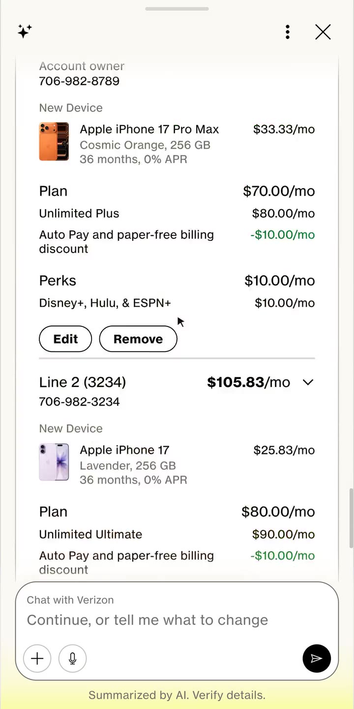
Setting up phones line by line in chat added a turn for every choice, and an order can have up to 12 lines. Users also preferred a widget to pure conversation when configuring a phone. A widget per line was ruled out too, since each one is a new turn and a new load. So I put every line in one widget, set in place and confirmed together.
05
Designed for empowerment
The assistant recommends the best bundle, but the customer stays in control. They can change any choice, by tapping or by typing. A fixed recommendation was simpler, but switchers need to feel the deal is theirs.
→myPlan: customers can see every plan and step a line up or down. The assistant shows what they gain or lose and how the bill changes.
06
Bot and web, in sync both ways
The website lagged behind the bot, showing stale steps. I designed them to stay in sync: a change in the bot updates the web, and after an order the web shows next steps. A page refresh after each step was ruled out, because it loses the customer’s place.
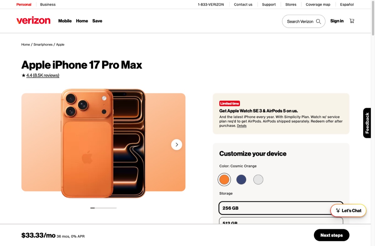
→Phone discovery: the phone the assistant recommends opens on the site’s product page.
→Cart: a change made in chat or on the site updates both, without a refresh.
→Order placed: the site moves on to the next steps.
60%
Fewer decisions to build an order
40%
Fewer drop offs across the switch journey
8/10
Customers found it easier to switch
Reflections
Organisational challenges
Two teams, one assistant
Two teams built it in parallel on different stacks, each proving theirs.
Separate revenue counts
Bot and web teams tracked revenue apart, which made cohesion hard.
Rules for legal copy
FCC broadband facts and legal copy needed set formats in chat.
Design challenges
No A2UI standard
Components differed across sales, service and Verizon Business, so we built a design system MCP with guardrails.
Widget, suggestion or chat
Research showed content plus a widget beats either alone.
Limitation
A2UI was experimental
We avoided complex nested components.
What were my learnings?
Fit the format to the decision
Chat for short answers, widgets for real work.
Widgets should not add turns
Actions inside a widget must keep the flow moving.
What we did well?
Started from the bill
Removed the comparing and choosing that lost people on the web.
Built the tooling
Our A2UI tool and the MCP kept screens consistent.
Agreed the voice
Content guidelines made the assistant sound like Verizon.